 This item type is structurally akin to the radio button type: there are more answers offered of which only one can be selected. It differs from the radio button type in that the answers are listed in a drop-down menu which saves screen estate.
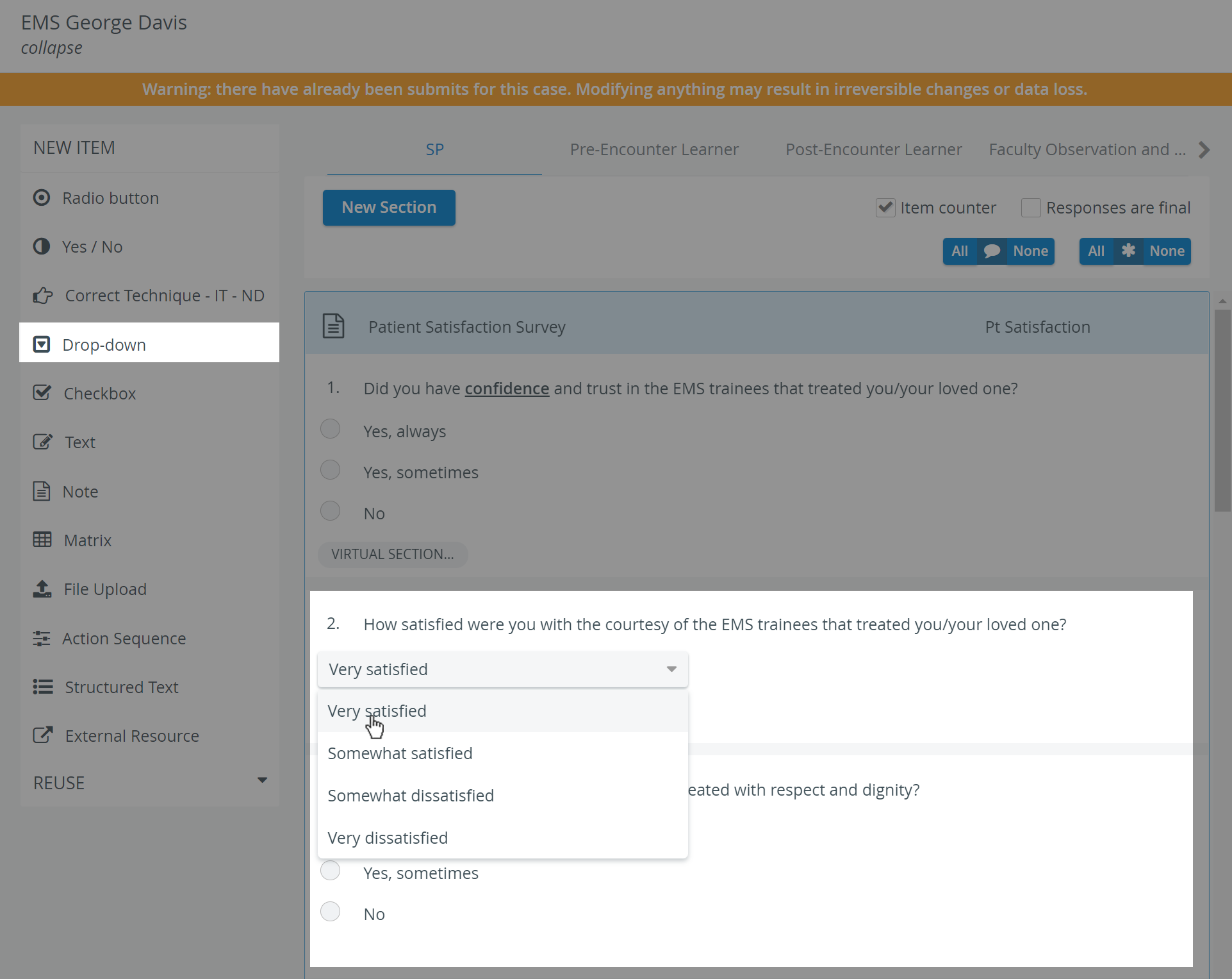
As opposed to the Radio button item type, where it is not recommended to add over about six choices of answers, in a drop-down, even dozens of choices can be fitted.
At data entry, respondents are shown the question and a drop-down menu. Once they open the drop-down, all the available answer options are listed and they have to select one. When modified, the selection switches to the recent choice, but undoing the selection is not possible. Respondents receive the score assigned to the answer they selected.
Scoring
Enter the question in the Question phrase field, then click the Set Answers button. In the prompted Answer Setup pop-up window, answers can be entered with the point value determined, including options for NS (not scored) and B (bonus). Add more fields by clicking the Add New Answer button, or delete any extra field by clicking the red X.
Use the buttons in the bottom right of the item panel for further options:
 Information - text field for additional information pertaining to the question.
 Asterisk: Answer required - if activated, a user cannot submit the checklist until that item is answered, that is, they cannot leave it blank.
 Comment box - when activated (darker blue), a text field is displayed at the item during data entry, providing space for additional notes.
 Copy - a fully created item can be duplicated, thereby copying the question and all the provided answers.
TIP: As with any added item, a copied one can be freely modified as desired. Add more fields by clicking the Add New Answer button, or delete any extra field by clicking the X icon appearing when hovering over the row to be deleted.
Overview
Content Tools